The Best Features in Android Studio 4.0 Beta
By Wajahat Karim • 29.Feb.2020
A basic overview of most interesting features in the Android Studio 4.0 Beta

Last week was somehow a good week for Android developers like me. For me, it was majorly because I became Google Developer Expert in Android officially. For other developers, it was because Google released the stable version 3.6 of Android Studio — the official IDE for Android development.
Using stable versions especially for production apps is a good choice, but I have been a fan of the canary and beta channels for a long time now. And Jetbrains Toolbox has been a life savior here as it allows you to use different versions of Android Studio like canary, beta, and stable at the same time. It even updates all the IDEs with respective channels without any headache for you.
{{< tweet 1227578610036412416 >}}
Thus, I am going to share you on what features you can use in the Android Studio 4.0 Beta right away even before the stable release of it.
Android Studio 4.0 Beta includes the IntelliJ 2019.2 platform release. This IntelliJ release includes many improvements from a new services tool window to much improved startup times.
There is a supporting video for this blog post if you would prefer to learn about new features of Android Studio on YouTube.
Layout Editor
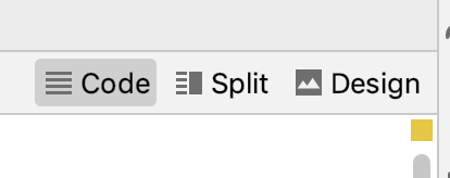
The most common and useful feature is the new layout editor. Although this is already part of the 3.6 stable release, but 4.0 beta brings some additional improvements in it. The new layout editor allows you to view your layout files in either only code, or split view with code and design at same time, or only design view. You can switch the modes of Layout Editor with these buttons on the top right of the layout.
Here’s a GIF example of the layout mode switching.
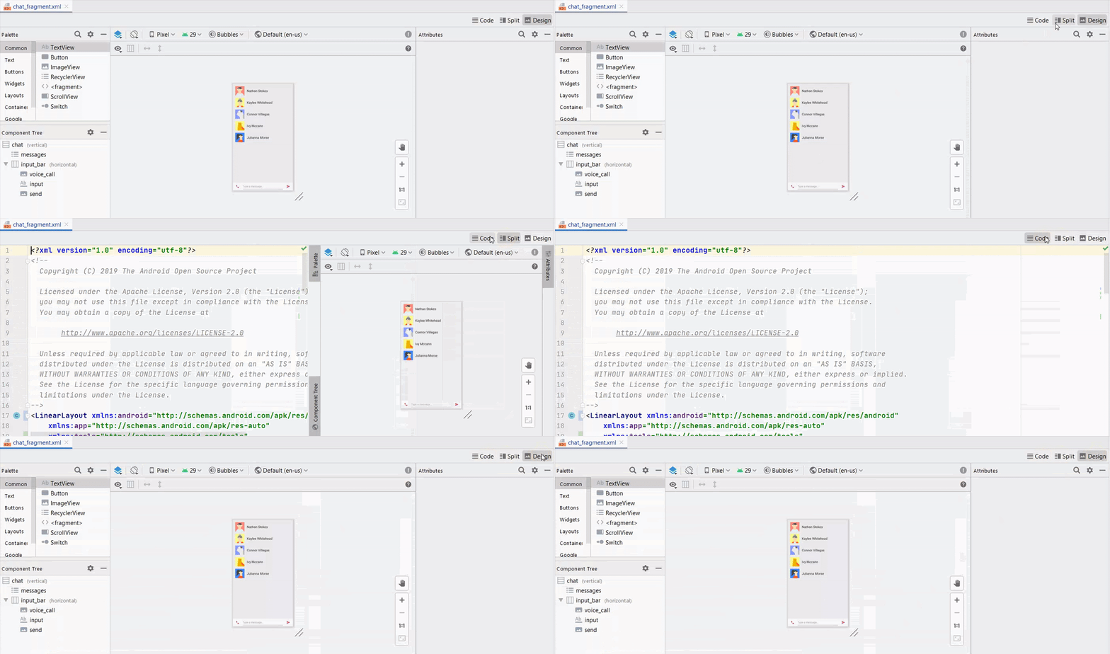
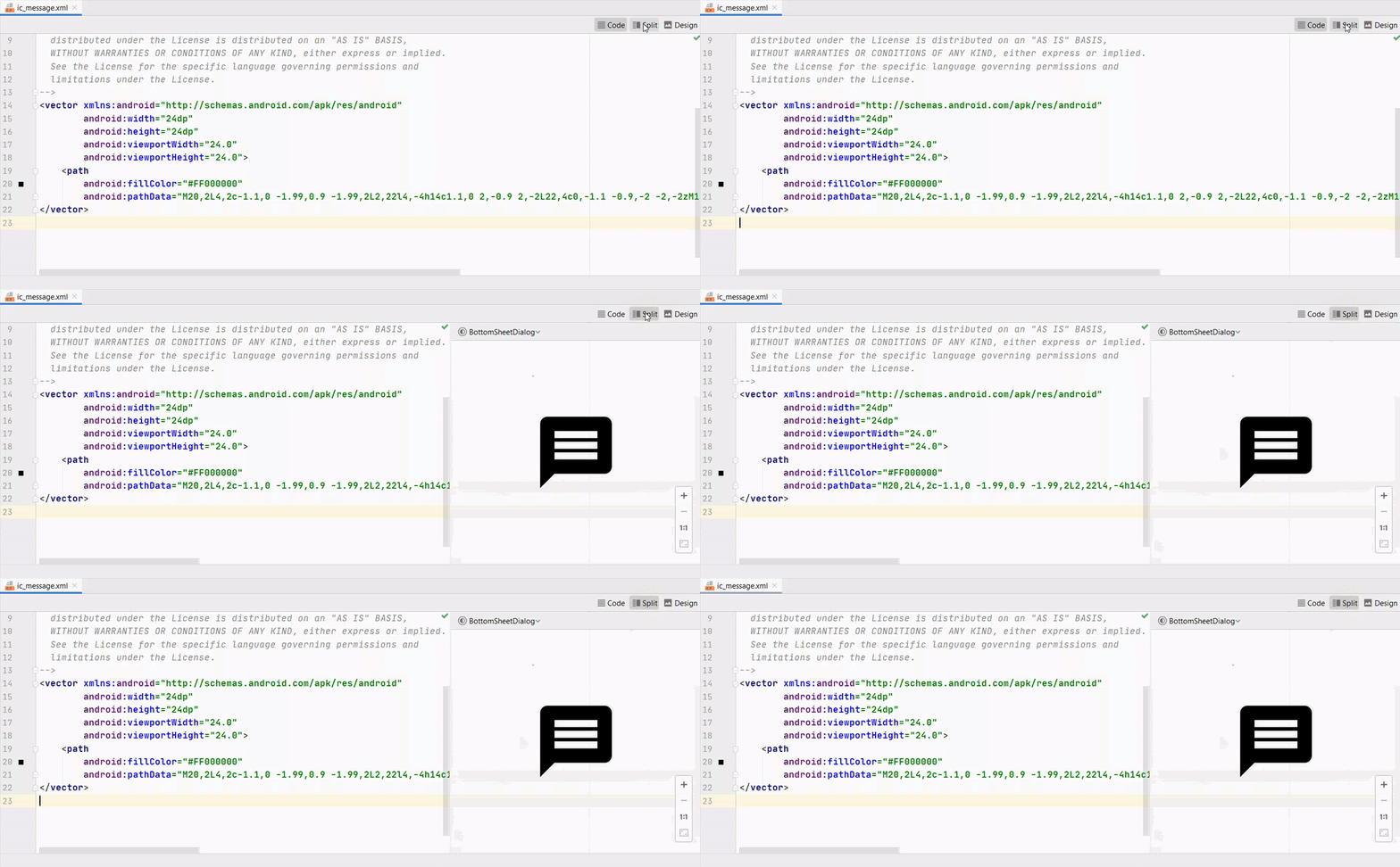
Android Studio has made this editor a common view for all the places where code and design are needed such as layouts, XML drawables, android vector drawables, and custom views.
Here’s an example of an android vector drawable below.
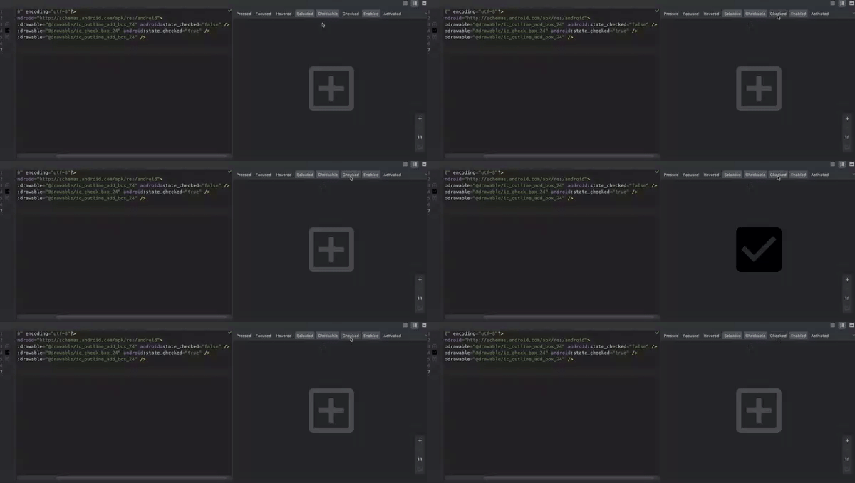
Not only this, if you have any custom drawable with multiple states, you can directly view those states in the design / split view.
And this is the most interesting and probably useful feature of Split View because you can even view your custom views directly in your code. There’s no need to add your custom view in any test layout and see how it responds. You can even see how your custom view behaves with width/height to wrap_content and match_parent as well. On other side, you can easily resize it simply by dragging and scaling as well.
{{< image classes="clear fancybox fig-100" src="https://ik.imagekit.io/z23yf8euyq/1_AcmBWNCUEatyj6ubh8vyFw.gif" thumbnail="https://ik.imagekit.io/z23yf8euyq/1_AcmBWNCUEatyj6ubh8vyFw.gif" title="Split Editor for Custom Views — Custom View example from RayWenderlich website tutorial>" >}}
Multi Previews
This is another feature which has come back as it was removed in the previous versions. This allows you to view your layouts in different variations of devices at the same time. Currently, Android Studio provides you the Pixel Devices variations by default.
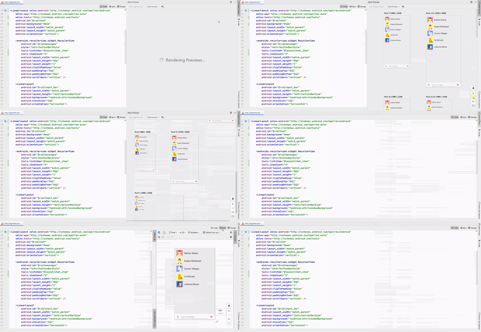
You can also view layouts in Color Blind mode to see it appears. You can customize the font size variations as well. Not only that, you can even add your own custom sets for your preview to see your layout’s reaction.
This is a separate feature than the split mode and can be used along side the split mode easily as shown in the above image.
Layout Inspector
This is a brand new tool in Android Studio and it allows you to view and inspect your app’s user interface in totally live mode. It updates in real time as you navigate around your app in real device and shows you full view tree hierarchy and attributes with their values.
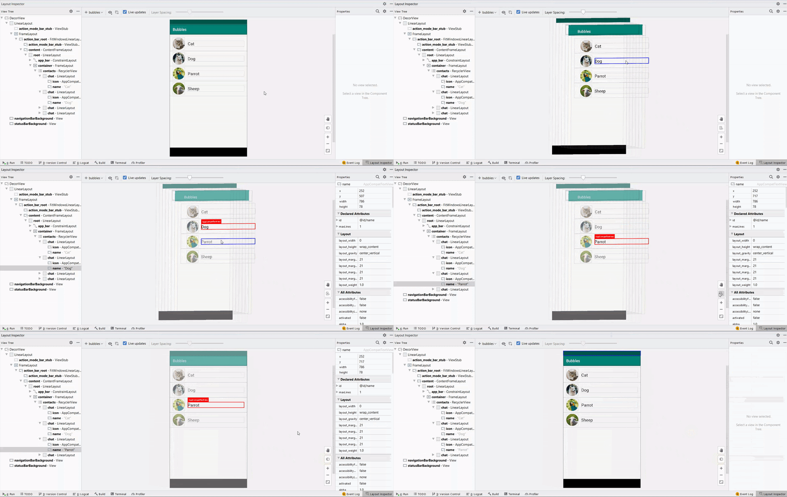
This works similarly as profiler does in Android Studio. You have to first run your debug only application in any emulator / device and then you can connect that through going in **Tools -> Layout Inspector **menu in the Android Studio.
Resource Manager
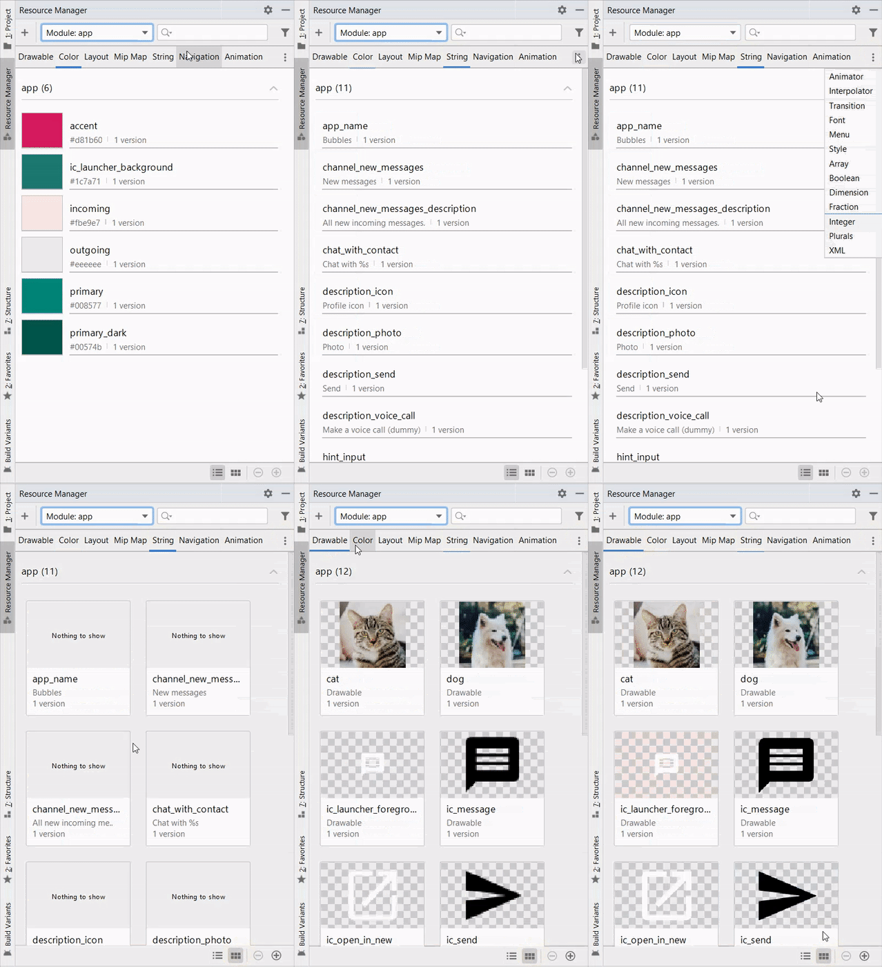
This was already added in the Android Studio 3.6 version and have got some more improvements in the Android Studio 4.0 version. You can view all your project’s resources, drawables, colors, animations, and anything which could be written in the XML language and put in the res directory.
Motion Layout
This is the most exciting feature for the Android developers who love creating animations in Android and find it very hard and frustrating to do so with the current APIs and tools. The Motion Layout is an extension to existing ConstraintLayout and is available since the 2.0.0 version of the ConstraintLayout .
To use the Motion layout in your apps, you first need to update your ConstraintLayout to 2.0.0 . At the time of writing this article, its on beta4 .
implementation 'androidx.constraintlayout:constraintlayout:2.0.0-beta4'
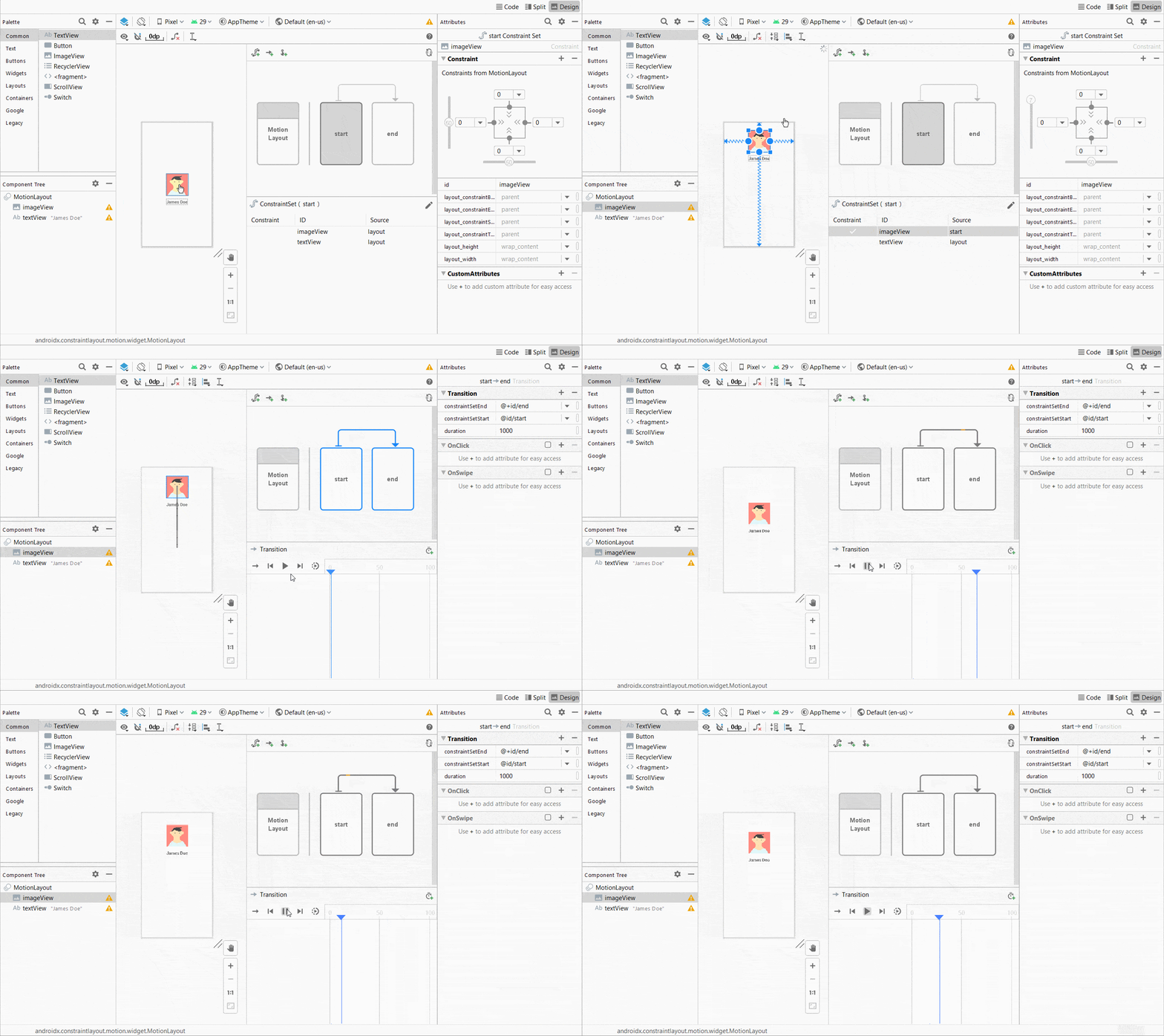
Once you have done that, you can simply convert any ConstraintLayout into MotionLayout by simply right clicking on it in the Components view and clicking on Convert to Motion Layout option.
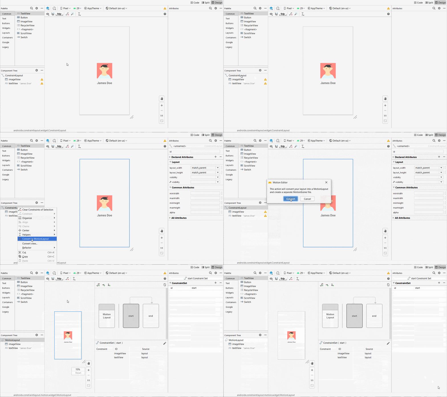
After the conversion, you can see the start and end frames by default. You can change the attributes between frames and Motion layout will handle the rest by animating and interpolating the value changes. Here’s a simple example of translation / moving of the profile picture.
Not only the motion layout, Google has also recently introduced the Material Motion Design system for simplifying the animations more in Android. You can read about that here.
Wrapping Up
So, in a nutshell, along with lots of bug fixes and minor improvements in features like Apply Changes, View Binding, Leak Detector, Profiler and so on, Android Studio 4.0 beta brings some very new features with lots of focus on design and animation in perspective.
Remember that currently Android Studio 4.0 is still in beta and 4.1 canary 1 is also available at this time, these versions may include bugs and problems. If you encounter any, file or submit feature requests and bugs on http://issuetracker.google.com — it’s a huge help to the Android and Google team.
At the end, please Subscribe to my newsletter DroidUp to learn learn about the latest things, tips, and skills in Android development manually handcrafted and curated by Wajahat Karim.