Setting up Dark Theme for Your App
By Wajahat Karim • 14.Jun.2022
Google have introduced native support of system-wide dark themes in Android 10. And with it rolling out in more and more devices every month, the need for Dark mode for your app is on-rise and demand. This article is going to explain on how you can set up dark theme for your next app.
The Benefits of Dark Theme
Before starting, let’s see what are the benefits of using dark theme for your Android application. The dark mode helps you with the following benefits.
- Reduces the battery usage of the device.
- Reduces eye strain, helping you in using phone in night.
- Facilitates the use in low-light environments.
Forcing App to Dark Mode Automatically
Ideally, your app should have support for all modes like light, dark, and system. If you’re in a hurry and want to implement dark-theme without spending more time on app, then you can do so with a very quick and short way.
By default, switching your phone theme to dark, you will notice that your app UI won’t change to dark colors. If you want to automatically change colors of the app by the Android system, you can do so by enabling override force-dark in Developer options. Here’s how you can enable force dark mode in the app code.
Go to your styles.xml theme file and set android:forceDarkAllowed to true like this:
<!-- Default Theme -->
<style name="Theme.Imagine.Base" parent="Theme.MaterialComponents.DayNight.DarkActionBar">
   <!-- Primary brand color. -->
   <item name="android:forceDarkAllowed" tools:targetApi="q">true</item>
   <item name="colorPrimary">@color/color_primary</item>
   <item name="colorPrimaryVariant">@color/color_primary_dark</item>
   <item name="colorOnPrimary">@color/color_on_primary</item>
 </style>
For some apps, this solution might be sufficient, for many it won’t. Colors might feel off brand, contrasts between components might become too low, and it might even be confusing to users if they don’t recognize the design due to a totally unknown color scheme.
This is where the actual proper way comes to help to add the fully functional dark-mode support for your app.
Save and Load User’s Preferences for Dark/Light Theme
A developer-friendly solution of customizing styles and colors would be using the Day Night theme at first. This will run on the devices with older versions than Android 10 as well and provide you backwards compatibility.
<style name="AppTheme" parent="Theme.MaterialComponents.DayNight">
   <!-- Customize your theme here. -->
   ...
</style>
Now run your app and if you are using a device running (Android 10) then your application will change its theme according to Android system. It will show as dark in dark theme etc. But if you are using an older device like Lollipop or Oreo, then you need to manually provide a toggle in-app setting to change the app theme, or you may say you would need to programmatically change the colors of the app.
A good approach for this setting would be to add a dialog like this and add the following three options.
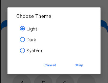
The Android OS provides APIs to set the theme based on the above-mentioned options.
MODE_NIGHT_AUTO: This option is usually configured by the Android OS system through the Display Settings. Users often set times to switch between light and dark themes, and that’s when this option is used. For your app, the dialog above will show the Follow System and it means app will show the theme which system provides, and it could be light or dark depending on the time of device.
AppCompatDelegate.setDefaultNightMode(AppCompatDelegate.MODE_NIGHT_FOLLOW_SYSTEM)
MODE_NIGHT_YES: This is for setting the app to dark theme by default no matter what time or configuration device is set on.
AppCompatDelegate.setDefaultNightMode(AppCompatDelegate.MODE_NIGHT_YES)
MODE_NIGHT_NO: This means the device will not be in the dark mode by default. This doesn’t mean that device will be in light though. It can also mean that if the device is configured to dark/light schedule, then it will also be followed with this option. This is used for Light and Follow System options.
AppCompatDelegate.setDefaultNightMode(AppCompatDelegate.MODE_NIGHT_NO)
MODE_NIGHT_AUTO_BATTERY. This is an extra option which is not put in the settings dialog (as seen in the above image). Setting this mode mean that the app will always be in light mode regardless of whether its configured or not. It will only show dark theme when the device’s battery is low and user has turned on the battery saver.
AppCompatDelegate.setDefaultNightMode(AppCompatDelegate.MODE_NIGHT_AUTO_BATTERY)
So, the idea to respect the app user’s choice of theme, you have to store the user selected option (from dialog like above) and save it somewhere persistent like SharedPreferences. You only will have to save the integer like AppCompatDelegate.MODE_NIGHT_AUTO_BATTERY, AppCompatDelegate.MODE_NIGHT_NO etc. And when the app starts, load that value from persistent storage and set it as the default mode of the app with the method AppCompatDelegate.setDefaultNightMode(). This is how you can save and load the theme which has user has opted for.
Managing Resources like Colors, Images, Drawables
Once your app is able to save/load user’s preferences of theme choice, it’s time for your app to show right resources like colors, images, drawables etc. in the right theme. You don’t want to show dark colors in the dark theme. Or you don’t want to show images with bright backgrounds in the dark theme.
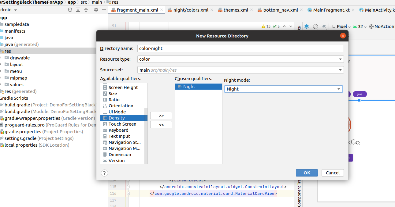
To manage this, Android provides you a way to separate resources for light and dark themes. Normally, you put all your colors in the colors.xml file in the res/colors directory. But these colors will be used for light theme and also dark theme if there are no colors provided for that. So, you would need to create another directory with the -night suffix like colors-night in the res folder and create another colors.xml file and put all the color values for the dark theme here.
It must be noted that both `color.xml` files in `/colors` and `/colors-night` directories should contain different color values but same names. Like for example, if you have a `CardView` in the code, you set it’s background color to `card_background_color`. The `card_background_color` will be added in the `colors.xml` files like this
<!-- res/colors/colors.xml -->
<item name=”card_background_color”>#FFF</item>


<!-- res/colors-night/colors.xml-->
<item name=”card_background_color”>#000</item>
And now you can use it for your CardView just like you use any normal color.
<com.google.android.material.card.MaterialCardView
       android:id="@+id/cardView"
       android:layout_width="match_parent"
       app:cardBackgroundColor="@color/card_background_color"
       app:cardUseCompatPadding="true"
       app:cardElevation="3dp"
       android:layout_height="wrap_content">
</com.google.android.material.card.MaterialCardView>
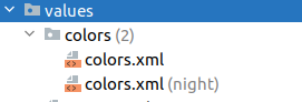
Now when you run the app, you will see that in light mode, CardView will be white and in dark mode CardView will be black. Android Studio will show you both colors.xml files in a combined directory like this.
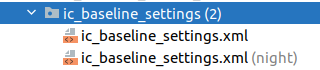
You can use the same method to separate your custom XML shape drawables or vector drawables by creating a directory `res/drawables-night` and putting all the night mode drawbales there. For example, here’s how a Vector icon with both dark and light asset will show in Android Studio.
Again, you have to use the exact same file name for both icons. And you can use that normally for your ImageViews etc like `app:src=”@drawable/ic_baseline_settings”`, You can also put different images in drawables and drawables-night directories. You can also apply this for your strings as well where you want to show different message for day and night.
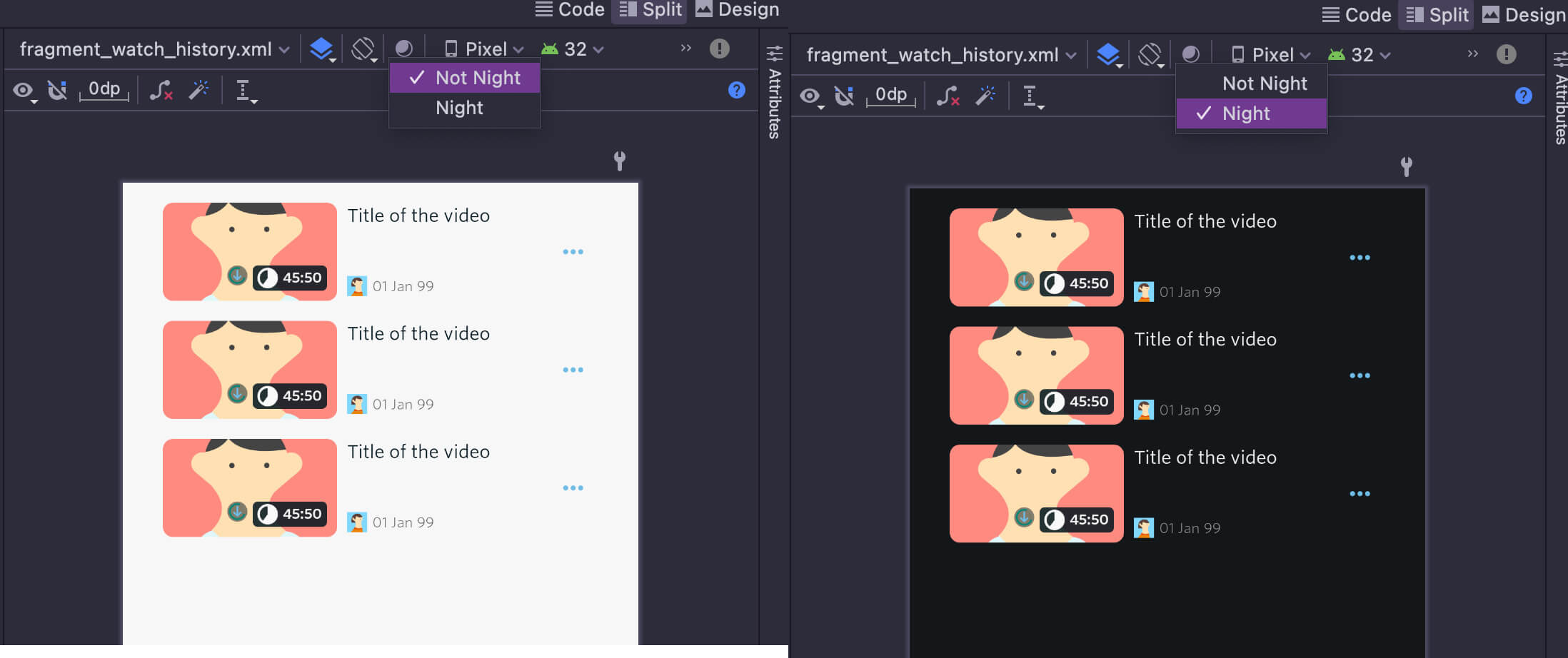
Android Studio also allows you to view your XML layouts in Dark/Light modes from the editor itself by choosing an option from a moon-like icon. In the below image, you can see a layout in both Dark and Light modes in the XML editor of Android Studio.
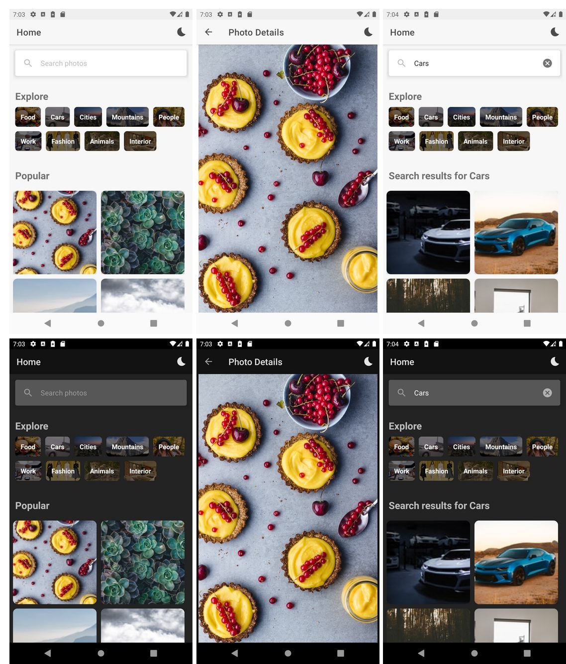
That’s how you can implement dark mode for your app. You can check an example app Imagine and how the colors and resources are used for the both modes in [the following Github Imagine repository](https://github.com/wajahatkarim3/Imagine).
You can check the code of this whole app on the following repository.
{{% linkpreview title="GitHub - wajahatkarim3/Imagine" subtitle="An simple image gallery app utilizing Unsplash API to showcase modern Android development architecture " link="https://github.com/wajahatkarim3/imagine" thumbnail="https://opengraph.githubassets.com/ee507fa6598667500968818ac563154d5df2a6363f7e5542bf43648d7b926c02/wajahatkarim3/Imagine" %}}
At the end, please Subscribe to my newsletter DroidUp to learn learn about the latest things, tips, and skills in Android development manually handcrafted and curated by Wajahat Karim.